
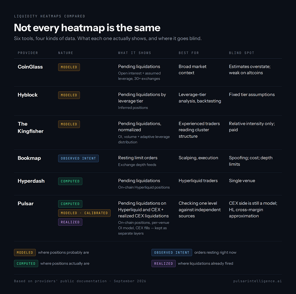
Why the bright bands on your chart can mean four completely different things, and how to tell which one you’re looking at
A heatmap is a chart that uses color to show where something piles up. In crypto trading, that “something” is usually money: resting orders, leveraged positions, or liquidations that have already happened. Price runs along one axis, time along the other, and the brightness at each point tells you how much is sitting there.
The problem is that the same picture (dark background, glowing bands) is used for very different data. A bright band on one platform shows orders people have actually placed. On another it shows a statistical guess. On a third it shows liquidations that already fired. Traders often read them the same way. They shouldn’t.
Why it matters for trading
Price moves toward liquidity because large orders need someone on the other side. Heatmaps try to show where that liquidity is before price gets there.
Liquidation heatmaps add a second mechanism. Once price reaches a zone with real leveraged exposure, the forced closes there can push price further and trigger the next cluster. Forced liquidations are market orders nobody chose to place. They are fuel that sits dormant until price touches it.
This is useful context. It is not a forecast. A heatmap can show where a chain reaction would have more fuel if price arrives, but it can’t tell you whether price is heading there.
How traders use it
Targets. A dense cluster above price is a common take-profit area, because a squeeze into it can overshoot.Stop placement. Keep stops out of the bright zone, not just behind it. Stops placed right at the cluster tend to get swept along with it.Reading reactions. With order book heatmaps, the signal is behavior, not size. Liquidity that stays firm may act as support or resistance, liquidity that is pulled before price arrives is less reliable, and large liquidity that is hit repeatedly but holds can suggest absorption.Confluence. A liquidation cluster that lines up with a level you already drew is worth more than either one alone.
All of this depends on knowing which kind of heatmap you’re looking at.
The comparison: how each heatmap is actually built
1. CoinGlass: the modeled liquidation heatmap
https://www.coinglass.com/pro/futures/LiquidationHeatMap
How it’s built. CoinGlass is the category default. When a liquidation screenshot circulates on X, it almost always comes from here. Centralized exchanges don’t publish individual positions, so CoinGlass has to estimate them. It estimates liquidation prices from open interest and assumed leverage distributions across exchanges, then applies standard liquidation formulas that account for maintenance margin and position size.
It offers three models. According to CoinGlass itself, Model 1 only counts high leverage (10x, 25x, 50x, 100x) and is meant for short-term trading, while Model 2 counts all leverage and suits longer-term trading. Lookback windows range from 12 hours to one year.
Pros
Free, fast, and covers many venues. It aggregates data from more than 30 exchanges, including Binance, OKX, Bybit and Deribit.It’s the shared reference. When everyone watches the same map, its levels can become self-fulfilling.
Cons
It’s a model. These are estimates built from open interest and assumed leverage, not liquidation data confirmed by the exchanges.It overstates. Actual liquidation amounts can come in lower than shown, because some traders close their positions before reaching their liquidation price.It degrades on smaller coins. Reliability is best on BTC and ETH and drops sharply on low-volume altcoins, where open interest is too thin to form meaningful clusters.
2. Hyblock Capital: leverage-tier liquidation levels
https://hyblockcapital.com/features
How it’s built. Hyblock uses the same estimation approach, with more control given to the trader. Its liquidation levels are clusters of price points where highly leveraged traders opened positions, with “high leverage” defined as 100x, 50x and 25x on both sides. The heatmap version computes liquidation levels from market data at different leverage amounts and places them into price buckets, and the color shifts as more estimated levels land at the same price.
Pros
Leverage isolation. You can hide lower tiers and focus on 25x and 50x if that’s where you believe retail is stacked.Research tooling. Hyblock lets traders backtest indicators, liquidation levels included, on historical data before risking capital.
Cons
It is still inference. The API describes its output as every open position Hyblock can infer, bucketed by leverage, which means positions are inferred, not observed.The fixed leverage tiers are an assumption. Traders who use 3x or 7x don’t appear where the model expects them.
3. The Kingfisher: the pioneer’s liquidation map
https://thekingfisher.io/bitcoin-liquidations-map
How it’s built. Kingfisher’s approach is the same basic idea as CoinGlass and Hyblock. Its documentation says it computes liquidation levels from market data at various leverage amounts, then aggregates and normalizes the results over time. Kingfisher says its version goes beyond simple open interest aggregation by adding margin threshold calculations and historical liquidation patterns. Its leverage distribution levels adjust to market conditions instead of staying fixed.
It offers two views of the same data. The “liquidation map” shows price against the relative strength of upcoming liquidations, a snapshot of where clusters stand now. The heatmap is a 2D rendering of a 3D dataset: time, price, and normalized cluster values.
Pros
Leverage weighting that adapts to the market instead of fixed tiers, which directly addresses the main weakness of the fixed-tier approach.Analytical depth for experienced traders. Kingfisher suggests reading Z-scores to spot possible liquidity manipulation, since high Z-scores near price can indicate engineered moves.Long track record and a trader community built around the maps.
Cons
Still a model, and Kingfisher says so. Its own site states that exchanges never publish where leveraged positions get liquidated, and that its map estimates this from volume, open interest and leverage tiers.Normalized output makes intensity relative, not absolute. The map shows relative strength, not dollar amounts, so you can compare zones within one chart but not size them.Most features are paid. The heatmap is available to Pro and Premium subscribers, with weekly trials.
4. Bookmap: the order book heatmap
https://bookmap.com/en/features
How it’s built. This is a different instrument entirely. It shows orders, not liquidations. Time runs along the X-axis, price along the Y-axis, and color intensity shows the volume of limit orders sitting at each price at each moment. The data comes directly from exchange depth feeds, so nothing is modeled.
Pros
It shows real orders, including their history. You see where limit orders sat, how long they stayed, and whether price consumed or rejected them.It is built for execution. You can place orders by clicking on the heatmap itself.
Cons
Visible does not mean real. Large resting orders are pulled and spoofed constantly. The heatmap shows intent, and intent can be faked.Depth limits. Some exchanges only send a limited number of price levels around the best bid and ask. Bookmap then displays the last known size for levels outside that range, which means part of what you see may be out of date.Cost and complexity. Plans run from a free tier up to about $99/month for Global, and real-time data feeds cost roughly $34 to $101+ per month on top. It rewards scalpers and is harder to use for swing context.
5. Hyperdash: computed from on-chain positions
https://hyperdash.com/?utm=blog
How it’s built. Hyperliquid changed the rules. Positions there are on-chain, so liquidation prices don’t need to be guessed. On Hyperliquid, because every position is on-chain, the data can be calculated precisely instead of estimated. The heatmap takes known positions, sizes, entry prices and leverage, and maps the exact price at which each one would be liquidated.
Pros
Ground truth instead of assumptions. No leverage tiers, no inferred entries.Near real-time. Hyperdash data updates every few seconds.
Cons
One venue. It shows Hyperliquid and nothing about the much larger CEX leverage on Binance or Bybit.The picture is still temporary. A dense cluster can disappear if traders close positions or add margin before price arrives.Everyone can see it, which makes the trade crowded. When a big cluster is visible, many traders position for the cascade, and the expected bounce afterward may not come.
6. Pulsar Intelligence: three layers, each labeled for what it is
https://app.pulsarintelligence.ai/
Pulsar’s heatmap starts from one principle: never mix data of different reliability into one color. It stacks three layers on one candlestick chart, and each can be toggled and inspected on its own.
HL Predicted (computed). Pulsar doesn’t assume leverage for Hyperliquid positions. It reads the liquidation prices Hyperliquid itself calculates for open positions and groups them into price bands scaled to each asset. Long liquidations are drawn below price in green and short liquidations above in red, with intensity by notional. None of the underlying data is modeled.
CEX Predicted (modeled, then checked). Binance and OKX don’t publish positions, so their pending liquidations have to be modeled, and Pulsar says so on every zone. The difference is how the model is built and held to account:
Per venue, not blended. Each exchange is modeled separately instead of averaged across dozens of venues with different margin rules. You can see which exchange a cluster sits on.Per leverage tier, visible. Zones are calculated separately for 10x, 25x, 50x and 100x, then merged into one density band. Hovering shows the breakdown by tier, so you can tell whether a zone is 100x noise or a wall of 10x positions.Calibrated against reality. Pulsar continuously measures how many real CEX liquidations land inside zones it predicted beforehand. The model is graded by what the market actually did, not only by how plausible it looks.
CEX Actual (observed). A separate layer shows where liquidations actually fired on Binance, OKX and Bybit, as time-bounded zones. The filter threshold is set relative to each coin’s own volume. “Battle zones,” where both longs and shorts were liquidated, are highlighted.
Why the layers are never summed. CEX liquidation feeds are sampled. Binance’s own documentation states that for each symbol, only the latest liquidation order within each 1,000ms window is pushed. During a cascade, dozens of liquidations can fire in one second, and the feed reports one. Adding that sample to a complete on-chain record would produce a total that is confidently wrong. Pulsar keeps each layer separate and lets the trader see where they agree.
Why this matters. Every other tool gives you one kind of map. Pulsar lets you put all three on one chart. A zone where computed Hyperliquid positions, modeled CEX positions and past CEX fills all line up is stronger than any one of them alone. A zone that only the model shows is weaker, and you can see that too.
Pros
Computed Hyperliquid liquidation prices instead of leverage guessesA CEX model broken out per venue and per leverage tier, and checked against real liquidationsClear labels on every zone: computed, predicted, or observed
Cons
The CEX layer is still a model. It’s better built and checked against outcomes, but CEX positions stay private for everyone.Hyperliquid cross-margin positions carry some approximation. Isolated-margin positions are exact.Hyperliquid coverage is weighted toward the largest accounts, not every wallet.It describes positioning. It does not predict direction.
7. Side by side
One market, four captures
Descriptions only go so far, so here is the direct test. We captured the same market on every platform we could access, within about fifteen minutes of each other, and put the results side by side.
How we captured them
Market: BTCTime: 14:18–14:33 UTC, 25 September 2026View: each tool at its native view. The time windows differ because the tools are built for different jobs: Bookmap for minutes, the liquidation maps for hours to weeks.Settings: each platform’s defaults. Nothing was tuned to make any tool look better or worse.
Hyblock and The Kingfisher could not be captured: their heatmaps require a paid subscription. Both are modeled maps, so the CoinGlass capture below represents the modeled approach.
BTC moved several hundred dollars during these minutes, so the current price differs slightly between images. The liquidation zones are what we’re comparing.
1. CoinGlass: modeled, aggregated across exchanges
CoinGlass Liquidation Heatmap, BTC, ~24h. Captured 14:18 UTC.
What to look for: many horizontal bands above and below price, built up over the day. The brightest are a yellow band just below price at about $83,600 and one above at about $85,250, with secondary bands near $83,150, $85,500 and $86,000. The bands are evenly spread on both sides of price, which is what you’d expect when positions are estimated from open interest and assumed leverage instead of observed. The color scale peaks at $48M, but that figure is an estimate.
2. Bookmap: resting orders and trades, not liquidations
Bookmap, BTC, ~90 minutes. Captured 14:20 UTC.
What to look for: this map shows something different. The bright red-yellow band follows price because that’s where limit orders cluster, while the blue further away means thin liquidity. The bubbles are executed trades: large red sell bubbles mark the drop from about $84,400 to $83,150 between 17:30 and 18:05. The column on the right is the order book at the moment of capture, with heavy resting liquidity between about $83,450 and $83,750, directly around price. There are no liquidation levels here at all, only orders that can be pulled at any moment.
3. Hyperdash: computed from on-chain positions
Hyperdash, BTC 1H, Historical view, ~3 days. Captured 14:29 UTC.
What to look for: a grid of cells, each a computed liquidation amount at a given price and hour on Hyperliquid. Below price, the brightest recent cells sit at about $83,450, $83,150 and $82,950, with the last one holding steady since late Sep 24. Above price, a single short band at about $85,600 has stayed in place for almost a day. Because the map is built from real positions, it looks patchy instead of smooth: clusters appear and disappear as traders open, close and add margin. The heatmap ends a few hours before the latest candle, so the most recent hours show no data.
4. Pulsar: computed Hyperliquid positions and modeled CEX positions, as separate layers
Pulsar, BTC 1h, HL Predicted + CEX Predicted layers, ~9 days. Captured 14:33 UTC.
What to look for: Hyperliquid positions drawn at the liquidation prices the exchange itself calculates, with longs below price in green and shorts above in red. The long side is heavy: a dense block from about $83,200 down to $79,000, with more near $77,000 and $75,000. The short side is smaller and layered, with bands at about $85,300–85,850, $86,300–86,900 and $88,200–89,200. The summary bar reads $2.2B of liquidations below price, so the downside carries far more fuel than the upside.
Hovering any band shows how much sits there, how many wallets hold it, and whether they are whales, smart money or retail. The venue bar along the bottom puts it in context: over the past day, Hyperliquid carried 12% of BTC derivatives volume, against 43% on Binance, 25% on OKX and 20% on Bybit. That’s why the CEX side needs its own layer: a Hyperliquid-only map leaves out most of the market.
What the comparison shows
The two computed maps agree on both sides. Below price, Pulsar’s cluster at about $82,800–83,200 and Hyperdash’s bands at about $82,950–83,150 cover the same area. Above price, Pulsar’s short band at about $85,300–85,850 contains Hyperdash’s band at about $85,600. That’s expected, since both read the same on-chain positions. It also shows why computed data matters: two independent tools reading real positions land on the same levels.
The modeled map comes close on shorts but differs on longs. CoinGlass puts short liquidations at about $85,250–85,500, next to both computed maps. On the long side, its strongest band at about $83,600 sits closer to price than where Hyperliquid positions actually are. Part of that is method: a model that assumes high leverage places liquidations near entry. Part of it is population: CoinGlass models CEX traders, a different group from Hyperliquid’s. Where a model and real positions disagree, one map alone can’t tell you which is right.
Three tools agree on one level above price. CoinGlass, Hyperdash and Pulsar all put a short cluster at about $85,300–85,600. Three independent maps, two methods, the same zone. If price rallies there, that’s where forced buying would add fuel.
The order book showed where the move stopped. During the capture window, Bookmap shows BTC dropping to about $83,150 and bouncing. That floor matches Hyperdash’s $83,150 cluster, the top edge of Pulsar’s long zone, and a secondary CoinGlass band. Levels where several independent maps agree are the ones worth attention, and no single map would have shown this one with the same confidence.
Each tool answered a different question. Bookmap: where are orders right now? CoinGlass: where might CEX positions be? Hyperdash: where are Hyperliquid positions? Pulsar: where are Hyperliquid positions, whose are they, and where does the CEX model put the rest? None of them said where price would go next.The takeaway
Before you trade off a bright band, answer one question: is this computed, modeled, or observed?
Modeled (CoinGlass, Hyblock, The Kingfisher): where positions probably are. Useful for broad context. Treat the intensity as relative, not absolute.Observed intent (Bookmap): where orders are right now, and can be withdrawn a second later. Watch how they behave, not how big they are.Computed (Hyperdash, Pulsar’s Hyperliquid layer): where positions actually are, on one venue.Realized (Pulsar’s CEX Actual layer): where the market already fought. Real history, but only a sample.
None of these tells you where price will go. Each one describes a different part of the market, and knowing which one you’re reading makes it more useful.
The strongest zone isn’t the brightest one. It’s the one where independent sources agree.
Not Every Heatmap Is the Same was originally published in Coinmonks on Medium, where people are continuing the conversation by highlighting and responding to this story.