
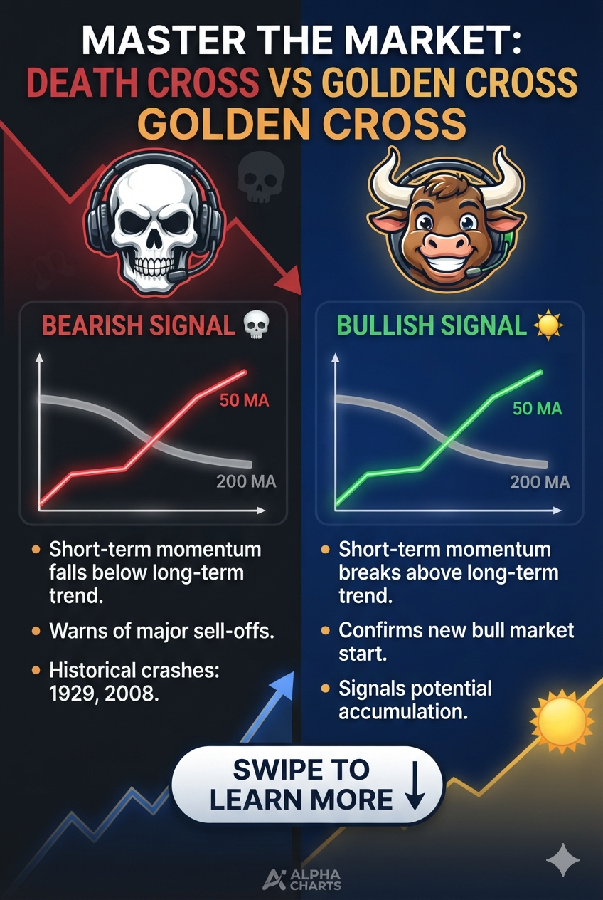
The Death Cross is one of the most famous signals in technical analysis. It sounds ominous, and for a good reason — it often warns of a major shift from a raging bull market to a painful bear market.
But what exactly is it, how does it compare to its bullish twin — the Golden Cross — and how do traders use them in real life? Let’s break down how these patterns work using two of the most popular indicators: the 50-day and 200-day moving averages.
💡 The Core Tools: Moving Averages Explained Simply
Before diving into the patterns, you need to understand the two lines on your chart:
The 50-day Simple Moving Average (SMA): This line calculates the average closing price of the last 50 days. It tracks short-term price momentum.The 200-day Simple Moving Average (SMA): This line tracks the average over the last 200 days. It represents the long-term trend direction and acts as the “anchor” for the asset’s true value.
📉 What is a Death Cross? (The Bearish Signal)
A Death Cross occurs when the short-term 50-day SMA crosses below the long-term 200-day SMA.
This crossover signals that recent price momentum is dropping sharply compared to the long-term track record.
The Three Phases of a Death Cross
A Death Cross doesn’t happen overnight. It typically plays out in three distinct stages:
The Peak: Buying pressure dries up, the price tops out, and the short-term 50-day SMA begins to flatten and slope downward.The Cross: The 50-day SMA officially dives beneath the 200-day SMA. This is the formal “Death Cross” signal.The Downtrend: The asset’s price continues to fall, trapped in a prolonged bear market where the 200-day SMA now acts as a heavy ceiling of resistance.
Real-World Examples
The S&P 500 (2008 Financial Crisis): A massive Death Cross triggered in December 2007. It successfully warned long-term investors to get out of the stock market before the worst of the global financial crisis wiped out trillions in equity.Bitcoin (2021–2022): Bitcoin formed a prominent Death Cross in January 2022 when it was trading around $43,000. Following the signal, the cryptocurrency entered a brutal crypto winter, eventually bottoming out near $15,500 later that year.
📈 The Opposite Signal: What is a Golden Cross?
The exact opposite of a Death Cross is a Golden Cross. This is a highly celebrated bullish signal that suggests a long-term bear market is ending and a massive uptrend is beginning.
The Setup: The 50-day SMA crosses above the 200-day SMA.What it means: Short-term buyers are aggressively driving the price up, overpowering the long-term downward resistance.Real-World Example: After the 2020 pandemic crash, the S&P 500 formed a Golden Cross in July 2020. This signal kicked off one of the fastest, most aggressive bull markets in stock market history.
🛠 How Traders Play These Patterns
Traders use these two crossovers as a macro compass to dictate their strategy:
Exiting Longs / Hedging (Death Cross): Long-term investors often use the Death Cross as a cue to sell assets, move to cash, or buy protective puts to shield their portfolio from a market crash.Entering Shorts (Death Cross): Aggressive day and swing traders use the confirmation of the cross to short the asset, betting the price will fall further.Buying the Breakout (Golden Cross): Investors use the Golden Cross as a “green light” to confidently accumulate shares, knowing the macro trend is now in their favour.Waiting for the Retest: Prices often bounce back temporarily right after a crossover to test the 200-day SMA line. Smart traders wait for this retest to enter their trades at a much better price point.
⚠️ The Catch: Why These Indicators Aren’t Perfect
While these signals have predicted major historic market shifts, beginner traders must be aware of their core flaw: they are lagging indicators.
Because moving averages look backward at historical data, a significant portion of the price crash (or price rally) has already happened by the time the lines actually cross.
The “Whipsaw” Risk (Bear/Bull Traps): Sometimes, a market experiences a sharp, temporary dip that triggers a Death Cross, only for the price to immediately reverse and skyrocket. This leaves short-sellers trapped in a bad position.
✨ Pro Tips for Better Accuracy
To avoid getting trapped by false signals, never look at a crossover in isolation. Pair it with these metrics:
Trading Volume: A valid Death Cross or Golden Cross should be accompanied by high, spiking volume. This proves institutions and big money are behind the move.Macro Environment: Crosses that happen during broader economic shifts (like interest rate cuts for a Golden Cross, or rate hikes for a Death Cross) carry much more weight.Support and Resistance: Always look for major horizontal support and resistance levels on the chart to confirm if the price is truly breaking out or breaking down.
➡️ The Bottom Line
The Golden Cross and Death Cross are powerful, time-tested tools for identifying macroeconomic shifts. While they shouldn’t be followed blindly due to their lagging nature, ignoring them on a major index chart is a risk few market participants can afford to take.
Not Financial advice for entertainment porpose only
Understanding the Death Cross and Golden Cross: A Trader’s Guide to Long-Term Market Shifts was originally published in Coinmonks on Medium, where people are continuing the conversation by highlighting and responding to this story.